
TERAFINA
SaaS Progress Bar Redesign

Goal: Redesign progress bar
Constraints: Short timeline
Role: UX Designer and Researcher
Tools: Illustrator, Invision
Deliverables: Test findings document, progress bar recommendations
Timeline: 3 weeks
Background
Terafina is an omni-channel sales solution that helps mid-market financial institutions onboard their customers to key banking products such as checking accounts, auto loans, etc.
The Tradecraft design team was called upon to evaluate their current platform and propose design recommendations to increase user engagement and reduce the user drop-off rate. Terafina gave us their funnel metrics and other KPIs to give us a better indication of where their users became disengaged throughout the form filling process. Our main goal was to figure out the pain points that the users were experiencing, and design a solution to alleviate those problems.
Process
To get a good picture of the pain points the users were experiencing, I conducted guerrilla usability studies on a small subset of participants to surface some insights about the product. First I created a discussion guide to help develop consistency across the usability tests.
I had the participants go through the form filling process and talk through their thinking process to elicit good feedback. I used Silverback to conduct the usability studies on their web-based platform.

The results that surfaced from the usability studies confirmed the drop-off points within the form filling process. Once the participants reached a certain point within the process, a lot of responses surfaced:
This is a lot of stuff and I'm only on number one... I would save and I might not come back
I feel a little bit frustrated that I have to go through all these steps...
To be honest I've filled these out before, and I got so tired I just quit
If the other pages are this long, this is going to take a long time
These responses helped us come to our first major finding: the users needed feedback about their progress and where they were in the form filling process.
After transcribing and synthesizing the feedback that we got from the usability studies, we determined the major pain points users experienced were as follows:
Not enough feedback about progress within the form filling process
Inconsistency across input fields and buttons
Uncertainty with documents and disclosure agreements
Lack of help buttons to clarify information
Referencing back to their funnel metrics, we came to an agreement that exploring different progress bar feedback mechanisms would help address the problem of users dropping off at a certain page in the form filling process.

Next, I did a quick analysis of the current progress bar.
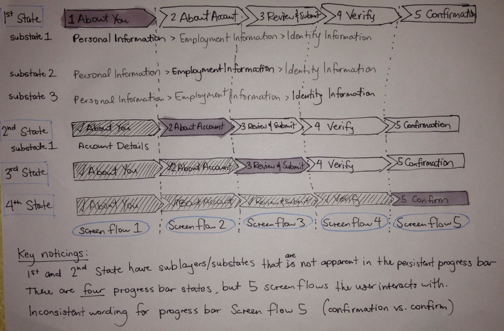
My analysis of the current progress bar
The current progress bar was chunky, disjointed, and lacked the feedback users needed to change their perception of time and where they were in the form filling process.
The biggest pain point the users experienced was in the "About You" section. This section contained mandatory fields such as First Name, Last Name, Address, etc. However, after filling out the first page, there were two more pages that needed to be filled out in the same step: Employment Information and Identity Information. These additional two pages weren't visually expressed in the progress bar; rather, they were nested underneath the progress bar. By the time the user got to the next section of the progress bar, they had already gone through three pages and had no feedback about far they had gone or how much longer the process would take.
Keeping this in mind, I moved to the next step of exploring different types of progress bars that would give the users the feedback they needed to remain engaged in the form filling process.
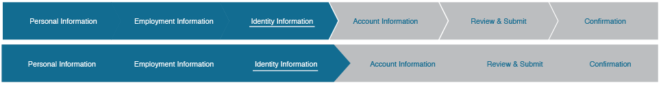
I looked at different progress bars and compared their feedback mechanisms to the current Terafina feedback mechanisms. I also took into account technical feasibility (can they be made in Bootstrap?) and different constraints such as time and developer resources.

My exploration of other progress bars
Ultimately I decided not to make drastic changes to the style of the progress bar. My gut told me that if the nested steps in the "About Me" section were input into the persistent progress bar AND there was some sort of percentage feedback indicating how much more of the form the user had to fill out, the user drop-off rate would drastically improve.
From there, I opened up Illustrator and started to mock up the redesigned progress bars.
Solution
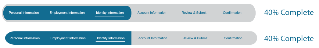
I brought the nested steps (Employment Information and Identity Information) up into the persistent progress bar to give better transparency on the number of pages the user has to go through. I also knew that I had to incorporate some form of percentage complete indicator for the user to know how much more time they had left. Below are the three progress bars that we placed in front of users to test their effectiveness:


Results
After getting these prototypes in front of users and the Terafina team, we ultimately decided on implementing the last progress bar. The Terafina team loved that one the most and the design resonated most with the users. It gave them the feedback they needed to understand where they were in the form filling process.
The Terafina team implemented the progress bar feature. Although it is not 100% the design we recommended, it is close to what we designed and still believe that it helps users understand where they are within the process, better than before.